How the Wrong Camera Angle Can Ruin Your Design
In an era where architectural decisions are increasingly driven by digital communication, a single rendering often becomes the first — and sometimes the only — impression a client or investor has of a project. Yet one crucial element remains surprisingly overlooked: camera angles.
At Ravelin3D Rendering Studio (https://ravelin3d.com), we’ve reviewed thousands of architectural visualizations, and we consistently see a pattern — brilliant designs weakened by poor camera choices. The difference between a strategically chosen angle and a generic one can determine whether your project is approved, funded, or forgotten.
Why “Show Everything” Doesn’t Work
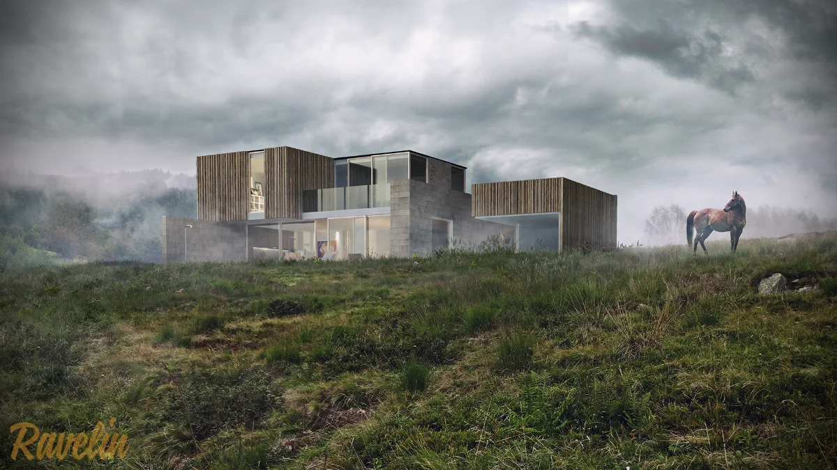
In architectural visualization, the angle is the message. A single shift in perspective can transform how a building is understood. Take this home in New Jersey: one rendering feels flat and unremarkable, while another — captured from a thoughtful, purposeful angle — reveals the project’s character and spatial logic.

The 3 Types of Angles That Work in Exteriors
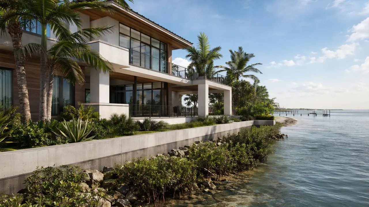
Hero Angle (Flagship Shot)
The one that defines your project — beautiful elevation, soft light, lush greenery, maybe even happy residents.

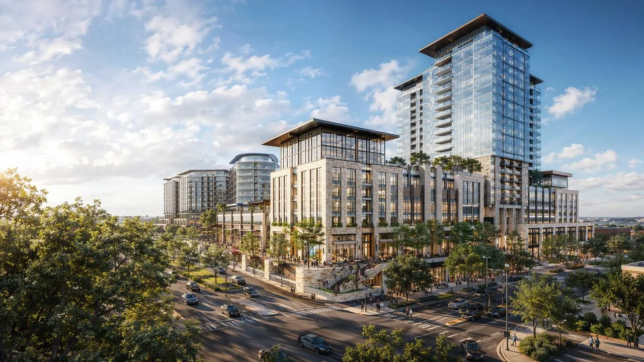
Aerial View
Perfect for showing infrastructure, rooftop amenities, and accessibility.

Close-Up
A favorite of ours — textures, facade materials, and the living experience. Harder to make, but they deliver powerful emotional impact.


The “Universal Angle” Problem
Trying to capture everything in one image — the building, the site, the roads, even the surroundings — may seem efficient, but it always backfires. Instead of highlighting the design, the image becomes flat, overloaded, and forgettable. Compare it with a focused, well-chosen angle and you’ll instantly feel the difference:

Interiors: Avoid the “Corner Trap”
Another common shortcut is using a single wide corner shot. It saves budget, but sacrifices impact. A classic example of an unsuccessful wide, generic, “universal” interior angle:

Better rules for interior angles:
- Keep camera height around 3.5 ft
- Align the camera perpendicular to the wall
- Use proper composition

Pro tip: set the camera slightly above the main surface you’re showcasing (table, sofa):

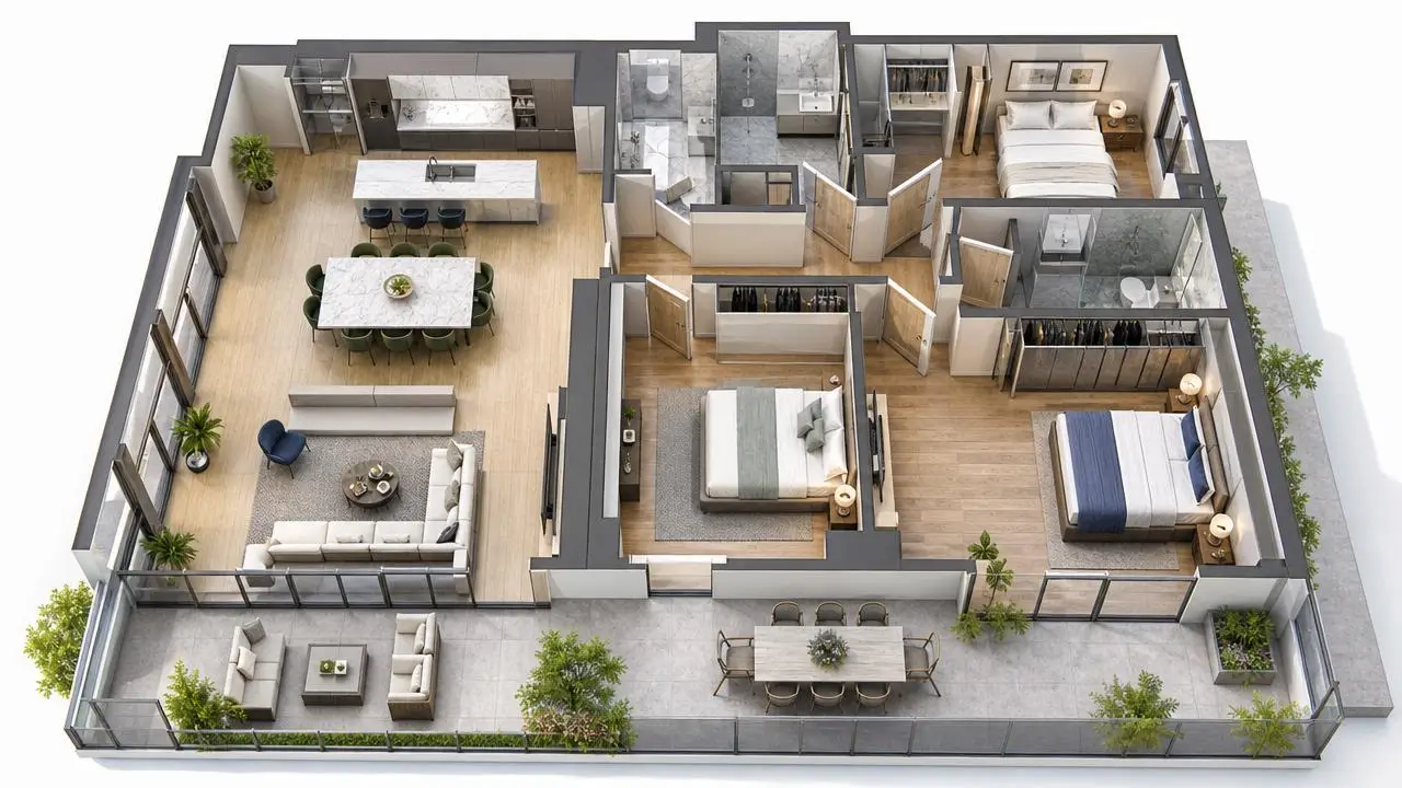
And don’t forget the “builder’s view” — overview shots that show walls, ceiling, and corners. Essential for technical understanding:

How Architects Can Build a Better Angle Strategy
1. Define the story before choosing the angle
Is the project about luxury? Nature? Urban lifestyle? Family living? Hospitality? The story determines the perspective.
2. Use angles to clarify design intent
Every angle should answer one question, such as:
- What makes this facade unique?
- How does the building meet the street?
- How do materials transition?
- How does the user enter and experience the space?

3. Limit wide lenses
Technical constraints shouldn’t dictate artistic choices.
4. Think in sequences, not single images
A good visualization package is a narrative, not a gallery.

5. Align with marketing early
- Developers know which images sell.
- Architects know which images represent the design honestly.
- Together, they create visuals that both convert and remain authentic.
What About You?
What rules do you follow when setting up camera angles?
We’d love to hear — share your thoughts in the comments on our Instagram reel.

'%3e%3cpath%20d='M23.3971%207.52388C22.0124%2010.1548%2018.9371%2014.2051%2016.3629%2016.8761C13.3954%2020.0856%206.39983%2024.4744%206.39983%2024.4744C5.85983%2024.7578%204.36066%2024.7794%203.94857%2024.3677L2.45719%2022.8802C2.14928%2022.3657%202.01074%2021.769%202.45719%2021.3931L5.44101%2019.1608C5.94593%2018.8196%206.5203%2018.7505%206.93239%2019.1612L8.77101%2020.9938C9.20365%2020.6901%2016.1096%2016.1642%2019.9512%209.93333L18.0687%208.05537C17.6566%207.6447%2017.7267%207.07175%2018.0687%206.56754L20.3066%203.59258C20.7187%203.04266%2021.3866%203.1812%2021.798%203.59258L23.2904%205.0797C23.8751%205.62856%2023.7057%206.90876%2023.3971%207.52388ZM24.5685%204.01742L22.2239%201.6799C21.5772%201.0336%2020.527%201.03396%2019.8796%201.6799L16.3633%206.35565C15.8261%207.14616%2015.7163%208.04758%2016.3629%208.69352L17.7983%2010.1247C16.7342%2011.5498%2015.4572%2013.1046%2014.0194%2014.5382C12.3937%2016.1589%2010.5852%2017.6329%208.95916%2018.8433L7.57196%2017.4611C6.9253%2016.8148%206.02176%2016.9239%205.2277%2017.4611L0.538854%2020.9675C-0.247056%2021.5093%20-0.108866%2022.6595%200.538854%2023.3058L2.8831%2025.6426C4.17853%2026.9345%205.86231%2026.521%207.57196%2025.6426C7.57196%2025.6426%2012.747%2022.7459%2017.1775%2018.3278C21.3451%2014.1715%2024.5685%208.69352%2024.5685%208.69352C25.2403%206.84994%2025.8636%205.30896%2024.5685%204.01742Z'%20fill='%23FFAA00'/%3e%3c/g%3e%3cdefs%3e%3cclipPath%20id='clip0_2729_2176'%3e%3crect%20width='26'%20height='26'%20fill='white'%20transform='translate(0%200.463867)'/%3e%3c/clipPath%3e%3c/defs%3e%3c/svg%3e) +1 (646) 693 0048
+1 (646) 693 0048
 main@ravelin3d.com