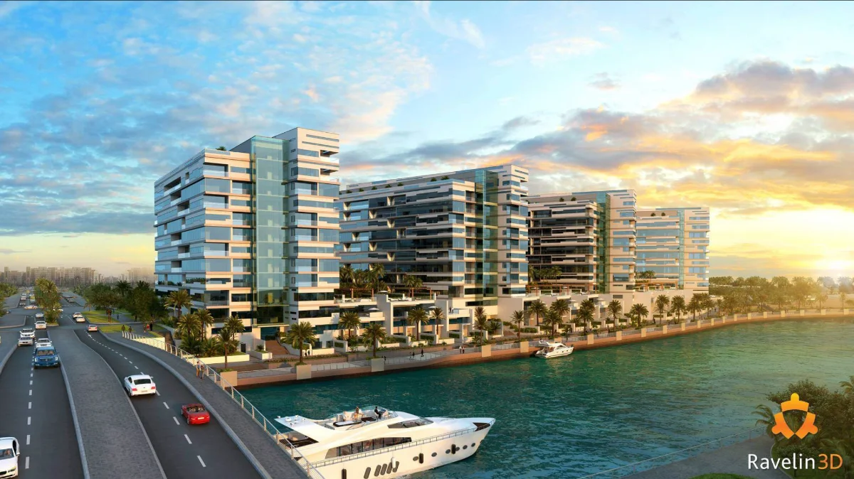
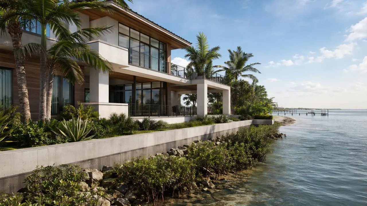
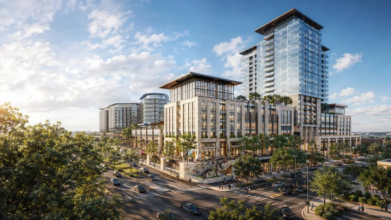
Don’t Sell Images — Sell Emotions: How to Create Architectural Renderings That Truly Convert in 2026
In today’s oversaturated real-estate market, beautiful pictures are no longer enough. Developers, architects, and marketers scroll through hundreds of 3D renderings every week — and most of them look the same. Perfect buildings, clean streets, glossy façades… yet no emotion.
And that is the secret that separates average renderings from high-performing marketing visuals.
At Ravelin3D, after more than 15 years in architectural visualization, we’ve learned a simple truth:
People don’t buy buildings — they buy lifestyles. They buy stories. They buy emotions.
In this guide, we’ll walk you through the key principles behind emotional 3D rendering — and the most common mistakes that silently kill your marketing materials.
1. Storytelling: The Hidden Power Behind Every Great Rendering
A rendering is more than a picture — it’s a micro-movie.
When potential buyers look at your visuals, they should immediately imagine themselves living there.
Many architects and developers try to show everything in one shot:
the house, the backyard, the fence, the entire neighborhood… even the highway nearby.
But universal images never sell well because they don’t carry a focused emotional message.
To make a rendering memorable and persuasive, build a story inside the frame:
- Show a father parking his car in the evening.
- Add kids playing football on the lawn.
- Show friends gathering on the weekend.
- Highlight the warm lights from the windows.
In a second, the viewer stops seeing “a building” — and starts seeing a future life. This is the essence of emotional rendering.

2. Lighting — The #1 Factor That Determines Impact
Lighting is the most underestimated tool in 3D visualization.
Two identical models with identical materials can look dramatically different depending solely on the lighting setup. Poor lighting flattens the image, removes depth, and kills atmosphere. Good lighting creates drama, mood, warmth, and a sense of belonging.
Why lighting matters:
- Evening lighting creates coziness.
- Golden hour adds romance and luxury.
- Morning light brings freshness and optimism.
- Night city lighting makes projects feel premium and modern.
When we show clients “before/after” lighting passes, they often can’t believe it’s the same model.
But it is — only the lighting changed.
For marketing materials, lighting is not a technical detail — it is the emotional engine of your rendering.


3. Materials — The Silent Quality Marker
Finishing materials determine whether a rendering feels premium, cheap, real, or artificial.
A professional visualization studio invests enormous time refining:
- subtle roughness variations
- micro-surface imperfections
- reflection behavior
- realistic color temperature
- physically accurate textures
Even when lighting, composition, and camera angle remain identical, materials alone can transform the entire emotional tone of an image.
Before approving final renderings, always compare material accuracy with:
- real samples
- manufacturer catalogs
- mood boards
- reference photography
Great materials = great realism = stronger emotional response.


4. DPI & Resolution — Why Your Printed Images Look Dark or Blurry
The tragedy of real estate brochures:
Renderings look amazing on screen, but extremely dark when printed.
This happens because monitors emit light, while printed paper absorbs it.
The solution is simple but usually ignored:
Always print a test copy.
Ask your printing agency to run one test page and increase brightness by 10–20% on their side.
Additionally, make sure your images meet professional print standards:
- minimum 5000 pixels on the long side
- 300 DPI
- exported in TIFF or high-quality JPEG
This alone can double the visual impact of your physical marketing materials.

5. Printed Images Are Too Dark — Why It Happens and How to Fix It
One of the most common issues in real estate marketing is that renderings look bright and beautiful on your monitor, but become unexpectedly dark once printed. This happens because digital screens emit light, while printed materials rely on reflected light — resulting in a naturally darker appearance.
Fortunately, this problem is easy to solve.
Always print one test copy before producing the full batch.
Ask your printing agency to run a single test page of your brochure or banner. In most cases, the brightness needs to be increased by 10–20% specifically for print output.
This simple step ensures that your renderings stay vivid, bright, and attractive — not only on screen, but also in every printed catalog, billboard, or sales brochure.


6. Don’t Start With a Big Project — Test the 3D Artist First
Developers often make the same mistake - they send the entire project to a new contractor immediately.
This is risky, expensive, and slows down deadlines.
A better strategy:
Start with 1–2 test images.
A small test allows you to understand:
- the artist’s workflow
- their communication style
- their ability to meet deadlines
- their attention to detail
- their quality under time pressure
At Ravelin3D, only 20–30% of our finished images ever enter our public portfolio.
This means even the best artists work under real project unpredictability — weather changes, reference inconsistencies, client revisions, rush deadlines.
A test project quickly shows whether the studio can operate under these real-world conditions.


7. Payment Terms — What You Can Negotiate
For large multi-rendering projects, upfront payments are standard.
But for smaller projects, many studios (including us) allow post-payment after delivery of the first drafts.
This is useful when:
- you want to test a new team
- the project has unclear references
- the initial scope may change
- you want to reduce risk and check compatibility
Agreeing on flexible terms is absolutely normal in the industry — as long as both sides clearly define milestones and deliverables.

8. Winter Renderings — Beautiful but Rarely Effective
Winter scenes look magical:
warm windows, snowflakes, soft atmosphere, holiday vibes.
But they have one major disadvantage:
snow hides details.
Clients cannot see:
- the house facade
- the territory
- materials
- textures
- landscape
Winter renderings should be used as a dessert — beautiful, emotional, limited. They are perfect as additional marketing content, but not great as core advertising materials.


9. Trust Your Gut — It’s Right More Often Than You Think
After 15+ years working with thousands of clients, we’ve discovered a surprising rule:
The first impression almost always predicts the final result.
If something feels off at the very beginning —
- communication is slow
- instructions are misunderstood
- drafts arrive chaotic
- deadlines shift
- the mood doesn’t match
— then the entire project will likely be stressful.
A great 3D visualization process should feel smooth, predictable, and enjoyable from the first day.
If it doesn’t — it’s better to switch the contractor early.

Final Thoughts: Renderings That Sell Are Renderings That Speak to the Heart
Clients don’t fall in love with walls, roofs, or facades.
They fall in love with:
- atmosphere
- emotions
- lifestyle
- dreams of the future
This is what separates simple “pictures” from powerful marketing visuals that sell faster and for higher value. If you want your next real estate project to stand out — focus not on the building, but on the feeling your rendering creates.
And if you need help creating emotional, conversion-driven visuals — Ravelin3D is always here.

'%3e%3cpath%20d='M23.3971%207.52388C22.0124%2010.1548%2018.9371%2014.2051%2016.3629%2016.8761C13.3954%2020.0856%206.39983%2024.4744%206.39983%2024.4744C5.85983%2024.7578%204.36066%2024.7794%203.94857%2024.3677L2.45719%2022.8802C2.14928%2022.3657%202.01074%2021.769%202.45719%2021.3931L5.44101%2019.1608C5.94593%2018.8196%206.5203%2018.7505%206.93239%2019.1612L8.77101%2020.9938C9.20365%2020.6901%2016.1096%2016.1642%2019.9512%209.93333L18.0687%208.05537C17.6566%207.6447%2017.7267%207.07175%2018.0687%206.56754L20.3066%203.59258C20.7187%203.04266%2021.3866%203.1812%2021.798%203.59258L23.2904%205.0797C23.8751%205.62856%2023.7057%206.90876%2023.3971%207.52388ZM24.5685%204.01742L22.2239%201.6799C21.5772%201.0336%2020.527%201.03396%2019.8796%201.6799L16.3633%206.35565C15.8261%207.14616%2015.7163%208.04758%2016.3629%208.69352L17.7983%2010.1247C16.7342%2011.5498%2015.4572%2013.1046%2014.0194%2014.5382C12.3937%2016.1589%2010.5852%2017.6329%208.95916%2018.8433L7.57196%2017.4611C6.9253%2016.8148%206.02176%2016.9239%205.2277%2017.4611L0.538854%2020.9675C-0.247056%2021.5093%20-0.108866%2022.6595%200.538854%2023.3058L2.8831%2025.6426C4.17853%2026.9345%205.86231%2026.521%207.57196%2025.6426C7.57196%2025.6426%2012.747%2022.7459%2017.1775%2018.3278C21.3451%2014.1715%2024.5685%208.69352%2024.5685%208.69352C25.2403%206.84994%2025.8636%205.30896%2024.5685%204.01742Z'%20fill='%23FFAA00'/%3e%3c/g%3e%3cdefs%3e%3cclipPath%20id='clip0_2729_2176'%3e%3crect%20width='26'%20height='26'%20fill='white'%20transform='translate(0%200.463867)'/%3e%3c/clipPath%3e%3c/defs%3e%3c/svg%3e) +1 (646) 693 0048
+1 (646) 693 0048
 main@ravelin3d.com